Data Art with 100k digits of pi
Data Art
As the name suggests, data art is an art created using data of any kind. Well, the definition may vary. It's not an exact science. Some may use random data while others may use real life data. I recently came across the concept from the R graph Gallery.
I started off the experiments with digits of pi, denoted as π. It is a mathematical constant and defined as the ratio of a circle's circumference to its diameter. Other definitions also exist, but this is good enough. It is also known as Archimedes constant.
It is an interesting number. It is an irrational number. \(\frac{22}{7}\) is commonly used as the value. The decimal equivalent doesn't end and also doesn't follow any known pattern. The lack of pattern satisfies a kind of statistical randomness. Anyway, that's too much of information.
#Art with digits of Pi
##Extracting data and preparing coordinates
The first step to start the art is to find the value of pi up to a certain number of digits. Several options are available. I used this.
I used the following code to extract data and create a data frame of coordinates by putting alternative digits in x and y.
 1library(dplyr)
 2library(ggplot2)
 3
 4#Defining URL to download csv (100k digits)
 5url<-"https://www.angio.net/pi/digits/100000.txt"
 6#reading file
 7data.raw<-readr::read_file(url)
 8
 9#splitting string into single characters
10data.vec<-strsplit(data.raw, "")
11
12#vector to dataframe and
13data.df1<-data.frame(data.vec[1])
14
15#removing the "." i.e. 2nd row
16data.df2<-data.frame(data.df1[-c(2),])
17
18#renaming column to digits
19names(data.df2)[1]<-"digits"
20
21##Dividing the digits into x and y
22#Adding a column of row number
23data.df3<-data.df2%>%
24  mutate(id=seq(1:nrow(data.df2)))
25
26#Adding a column of coordinate (x or y) and reshuffling the columns
27data.df4<-data.df3%>%
28  mutate(cor=ifelse(id%%2==0,"y","x"))
29
30
31#changing class of digits to integers. Earlier parsed as char
32
33data.df4$digits<-as.integer(data.df4$digits)
34
35#Creating data frame of x and y coordinates
36x<-data.df4[c(T,F),1]
37y<-data.df4[c(F,T),1]
38
39data.cor<-data.frame(x,y)
40
41head(data.cor)
1##   x y
2## 1 3 1
3## 2 4 1
4## 3 5 9
5## 4 2 6
6## 5 5 3
7## 6 5 8
Conceptualizing and creating the art
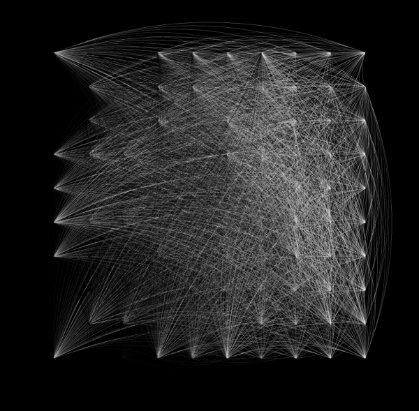
I decided to create an art using curves. I divided the coordinates into groups of thousand.In each group I plotted curve connecting all the dots to the first one. It created an interesting art which I like.
 1#creating a column showing row position
 2data.cor$pos<-seq(1:nrow(data.cor))
 3
 4#defining the size of each group
 5lot=1000
 6
 7#Creating groups
 8data.plot<-data.cor%>%
 9  mutate(grp=floor(pos/lot)+1)
10
11
12#Creating vectors with coordinates of first dot of each group
13minx=NULL
14miny=NULL
15for(i in 0:(49999)){
16  j=(floor(i/lot)*lot)+1
17  minx[i+1]<-data.plot$x[j]
18  miny[i+1]<-data.plot$y[j]
19}
20
21#creating columns from vector
22data.plot$xend=minx
23data.plot$yend=miny
24
25#Removing rows containing coordinates of first point of each group
26
27rowrmv<-c(which(data.plot$x==data.plot$xend & data.plot$y==data.plot$yend))
28
29data.plotf<-data.plot[-rowrmv,]
30
31#Plotting
32art100k.1<-data.plotf%>%
33  ggplot()+
34  geom_curve(aes(x = x, y = y, xend = xend, yend = yend, colour = factor(x)),
35             curvature=0.2,alpha=0.2)+theme_void()+ scale_color_brewer(palette="Greys")+
36    theme(legend.position = "none",panel.background = element_rect(fill="#000000"))+
37                                              xlim(-1,10)+ylim(-1,10)
38
39plot(art100k.1)
I used a palette with limited number variants. Hence there was an error. But I don't mind that. You can experiment with different colours. Later, I edited the image output.
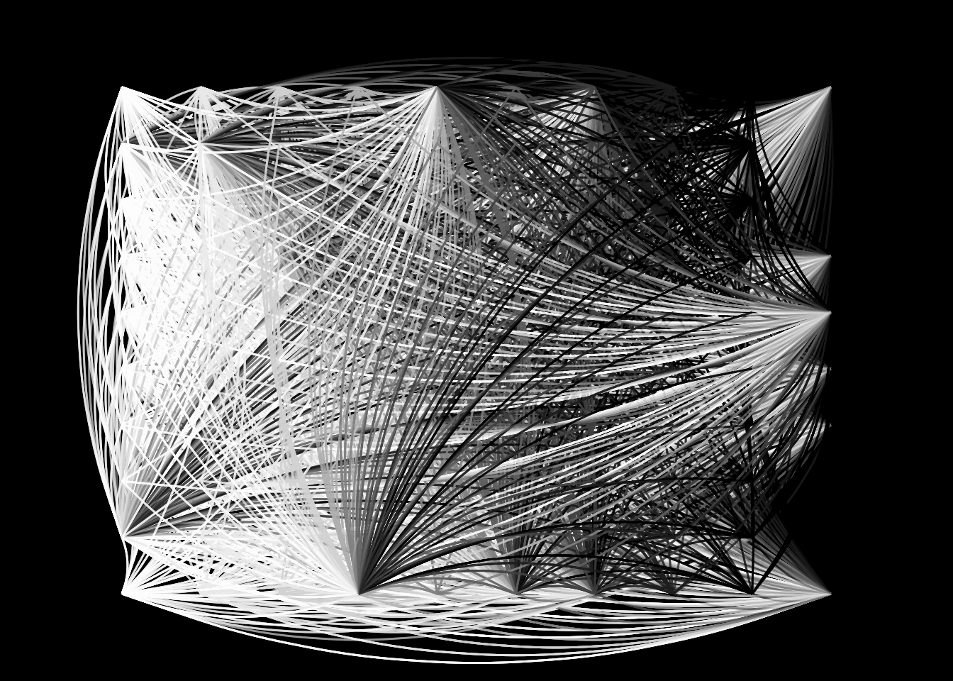
You can experiment further by changing the number or form of groups; even connect them to different points. Don't forget to share with me what you created.